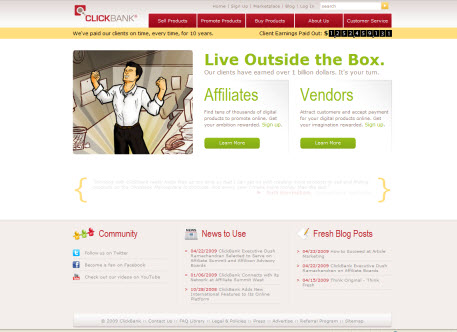
I just noticed that Clickbank ( which is a really cool marketplace for affiliates to go and find products to promote )appears to have received a facelift. It’s now a lot more colorful with red, orange and bright green headings now introduced into the mix. It also now has a client earnings figure updating in realtime like a virtual bajillions jackpot machine on the homepage.


{ 1 comment… read it below or add one }
I don’t like the changes, it just doesn’t seem as professional as before